
If you’ve ever done research on how to improve your website, you have probably come across articles that discuss placing certain kinds of content “above the fold,” or “below the fold.”
In this article, I will explain what the fold is, and why it’s important to optimize the information appearing above the fold. I’ll give you some tips on how to optimize your site with the fold line in mind, and get into why we look at web pages the way we do.
Hold On…What Does “Fold” Mean?
Talking about the “fold” in a web page is a holdover from the newspaper world. Newspapers come to us folded into a neat package, making it easy to carry around a bundle of large printed pages.
The part of that package that you see first is the top half of the front page. The section “above the fold.”
Back in the grand old days of the twentieth century, most sizable cities had more than one local newspaper. That lead to competition, and the newspapers correctly assumed that you were most likely to buy the paper that caught your eye.
This would be the one with the information that was most appealing to you. And in order to catch your eye quickly, they put that information above the fold.
A lot of what the newspapers learned about making an attractive above the fold presentation a hundred years ago applies to your website today. Because while times, and news delivery, have changed, there are many things that we still do in the same way.
When we first encounter a page, whether that page is on paper or on a screen, we all have the same “visual center.” The visual center is the upper left portion of the page or screen*.
Aside from gravitating to the upper left when we first look at a page, if we stay on that page, our continued attention also leans to the left. Knowing where people look gives us a good idea of where to concentrate our most important message on a page.
Above the Fold Content
If you aren’t convinced that concentrating your efforts above the fold is important, think about this: many early web users didn’t scroll at all. Their resistance to scrolling wasn’t necessarily the same as resistance you might run into today, but for all practical purposes, it is.
Those early users thought that what they could see when they landed on a page was the entire piece of content. Today, a potential visitor to your site knows there’s probably more and assumes they will have to scroll.
But when they land, they are making a decision: Is this page worth my time and attention?
Your visitor today also have more to deal with in the way of distractions. So not only do you have to convince them that your page is worth their time, you need to convince them rather quickly. In a previous article, I talked about the fact that you only have ten seconds to grab a visitor’s attention.
Depending on who you believe, that number could be considerably less. No matter what the number is, it’s pretty clear that you have to make your point as quickly and efficiently as possible.
Okay, I Want All the Important Stuff Above the Fold, How Do I Do It?
One could take “above the fold” advice to mean that the ideal would be to create an above the fold website. A site where everything is clearly visible at first glance has potential. That’s not possible, and not advisable as you’ll see below, unless your entire website consists of only a few sentences.
So let’s look at what should be above that fold.
Before deciding what should be displayed at the top, we need an idea of where that fold is. Prevailing wisdom considers the area above the fold on a webpage to be the top 600 pixels of your page. Now 600 pixels may not sound like much, but this is what it looks like.
![]()
That’s a pretty good amount of space. But what do 600 pixels look like on a tablet or phone or that screen embedded in your new refrigerator door? I can’t really show you here, but the answer is, not the same as they look on a desktop monitor.
You’re reading an article about website design as it relates to conveying your message, so I’ll assume your website is responsive. Or you’re working on making it mobile friendly. So you know that once you shrink the screen, dozens of other factors come into play. And often our ideas of what we want our pages to look like go right out the window.
Rather than thinking about the area above the fold as a specific size or space, think of it as whatever a visitor sees when they land on your page. No matter what type of device or screen size they’re using.
What Must Be Above the Fold
Regardless of how much real estate is available to occupy, these are the things that must live above your fold.
1. An Informative Title (Header)

Sounds obvious, doesn’t it. Yet there are still websites, a lot of websites, that forego a title and launch right into a clever tag line designed to draw visitors in. That’s fine if they are likely to recognize your clever tag line or slogan. But if there’s a chance that a visitor is not familiar with you already, tell them who you are. Make it obvious, plain and clear.
2. An Informative, Engaging Subtitle (Subheading)

This is where the meat of your message should be or that clever tag line. The single most compelling reason for a visitor to stay on your page should sit squarely in the visual center, the top left portion, of your page.
What Should Be Above the Fold
Wait, there are only two things that must be above the fold?
Sometimes.
If those two things are done right, the incentive to stay or scroll will be there. But to be fair, those cases are not the norm. Most of us need more than a tile and a sentence or two to compel visitors to spend their time with us.
So in addition to a nice clear title and a subtitle, your most powerful weapons are:
3. The Call to Action
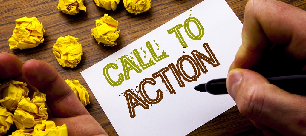
A call to action is often a call to buy or to learn more with the eventual goal being a purchase. But the secondary idea is to engage the visitor by getting them to interact with the page.
If someone is trying to sell you something expensive, they are probably not going to put a “BUY NOW” button above the fold. You’re going to need to do some convincing. So the call to action could be a value proposition, or a customer story – something to get you into the buying frame of mind.
If, on the other hand, they are selling something that is relatively inexpensive, like an impulse item, or something that they know you’ve purchased in the past, a “BUY NOW” button is exactly what they want above the fold. They probably don’t have to spend time trying to convince you. The developer just needs to direct you to a way to buy the item as quickly as possible.
“Action” doesn’t always equal “purchase.” If you run one of those rare and mysterious websites that aren’t trying to sell anything, you will still benefit from a call to action.
If your site’s focus is art, literature or culture, you still need to convince visitors that it’s better than other industry or niche sites. Use your call to action to draw the visitor in, get them started and show them what you’ve got to offer.
As you can see, a call to action is not a one-size-fits-all proposition. It has to be tailored to the purpose of the page. It could be something as simple as commenting on a blog post or telling readers to follow social media profiles.
4. Answer the Visitor’s Questions

Sometimes it’s difficult to boil your message down to a title and a couple of descriptive lines. But above the fold thinking requires you to do just that.
Look at your above the fold message objectively. Ask yourself if what you’re saying could raise any questions in the mind of someone unfamiliar with what you do or sell.
If so, tailor your message to answer those questions. If you can’t answer the questions with a brief message, create a clear action that will take the visitor directly to those answers.
Almost every day I come across at least one website that was obviously built by professionals. People who know what they’re doing. Sites that probably cost a great deal of money and time to produce. They are things of beauty.
Yet somehow I have absolutely no idea what the site is for, what the company does or why I should care.
Since I’m always curious about why people build things the way they do, I’ll take the time to look around and see what’s happening. But be aware that most visitors don’t care why your website is uninformative.
They just leave.
Don’t be vague, coy, enigmatic or bewildering. Lay your cards down on the table and let your visitors see your hand.
5. Use a Compelling Image
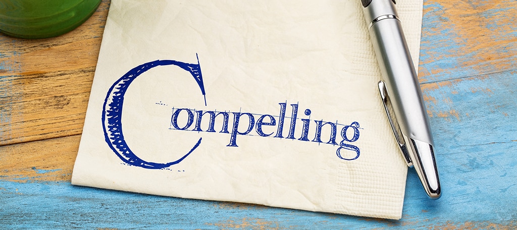
Humans are visual creatures, and the web is a visual medium. A striking image can sometimes do more to convince a visitor to stay than words can. If you can combine the right words with the right image, you have a powerful tool at your disposal.
Images can be photographs, illustrations or any kind of graphic element that represents the purpose of the page or site. This article from Smashing Magazine does a great job explaining the power of the right image.
An image isn’t right for every application, but there are very few websites that can’t benefit from a well-chosen graphic.
6. Offer a Coupon or Discount

If you’re selling goods, nothing says “we want your business” more than the immediate offer of a discount. How you present the coupon or offer is important.
For instance, a lot of sites use popups that hide the page and its contents.
Those popups can work against you if the visitor hasn’t had time to figure out what you’re selling. Make sure you leave sufficient time for your message to sink in before covering your page with a popup.
Better yet, work the coupon or offer into your above the fold content so it’s visible alongside your message.
7. Don’t Flaunt Conventions

Web conventions, that is, not society’s conventions though some products depend on doing that too…
- Don’t present a visitor with a graphic that looks like a button but doesn’t behave like a button.
- Never underline text that is not a link.
- Try not display text in a fixed size font that could become too small to read on a small screen.
The same website usability guidelines that you follow in general should be followed when you’re designing with a page fold in mind.
8. Make Sure Your Above the Fold Environment Doesn’t Look Like an Advertisement

Even if it is, it’s best not to make it obvious that content on the top look like an ad. Most of us have “banner blindness“, and we automatically ignore anything that looks like an advertisement on a page.
Use the area above the fold to make your pitch, but don’t frame it in the same way you would frame an advertisement.
9. Avoid the “Illusion of Completeness” Trap

Above the fold thinking can be taken too far. Some sites present a design that fills the browser window completely and are designed in a way that gives the impression that there’s nothing below the fold.
Your above the fold message doesn’t have to stand separate from the rest of the page. If you need an icon pointing down indicating that a visitor can scroll, you’re doing it wrong.
When you’re doing it right, your above the fold message becomes an organic part of a larger page. The visitor doesn’t even realize that you are using your knowledge of their behavior to deliver your message.
10. End on a High Note

It’s worth remembering that it’s good to focus on the fold, but don’t forget the rest of the page.
Particularly, the bottom of the page.
If your pages are informative and engaging you can place a call to action at the bottom of the page as well. Once you connect with a visitor using relevant, interesting content that they find valuable, you can scatter the top elements we’ve been talking about throughout your pages.
You should always focus on keeping visitors engaged, and the one sure-fire engagement method that will never fail is relevance.
If you can provide relevant, useful content, Google will reward you with better search result placement, and your visitors will stick around long enough to hear your story.
Here We Are at the Bottom of the Page
And you’re still with me! Thanks.
To sum up our above the fold optimization suggestions, here they are in a handy top-ten list.
- An Informative Title (Header)
- An Informative, Engaging Subtitle (Subheading)
- The Call to Action
- Answer the Visitor’s Questions
- Use a Compelling Image
- Offer a Coupon or Discount
- Don’t Flaunt Conventions
- Make Sure Your Above the Fold Environment Doesn’t Look Like an Advertisement
- Avoid the “Illusion of Completeness” Trap
- End on a High Note
More than 500 years ago, Johannes Gutenberg developed movable type to print books. The Chinese had been using moveable type for 500 years before Gutenberg’s “invention,” but Johannes apparently had a better PR firm, so it’s his name you read now.
Shortly after the press was invented, people started publishing newspapers. Today, ink-on-paper newspapers are close to extinction. But the insight that newspaper publishers gained as they learned about how we read is still useful.
*Flip everything we’ve talked about here horizontally to apply these ideas to right-to-left languages. For example, for an Arabic reader, the visual center of a page is the upper right.
Great information regarding Above the Fold Content that will help us a lot in our job.
Thank you, Michael Phillips!